Create a Fashion Moodboard That Guides Your Wardrobe
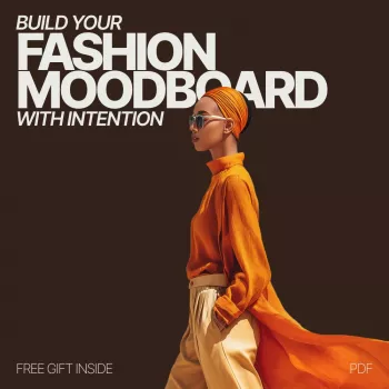
Build Your Fashion Moodboard With Intention
A fashion moodboard becomes truly useful when it stops being a folder of pretty pictures and starts acting like a decision tool. Done well, it clarifies what to wear, what to shop for (and what to skip), and how to style outfits so they feel like “you” in real life—not just on a runway or in a perfectly lit photo. For more guidance, see Examining craft-education students’ conceptual design.
Below is a structured, low-overwhelm way to choose a direction, collect references with purpose, edit for clarity, and translate your final board into a wearable wardrobe plan. For further reading, see Create a Fashion Mood Board: A Step-by-Step Guide.
Start With a Style North Star
Before you save a single image, decide what you want the moodboard to do for you. A clear outcome keeps your board from turning into a random collage of competing aesthetics.
- Define the outcome: everyday outfits, a workwear refresh, event styling, a capsule wardrobe, or a seasonal shift.
- Pick 3–5 feeling words: for example, polished, relaxed, dramatic, sporty, romantic, minimal.
- Set boundaries that reduce overwhelm: preferred silhouettes, comfort needs, climate, dress codes, and lifestyle activities.
- Identify what must stay vs. what must change: keep favorite colors or signature items; update fits, shapes, or trends that don’t feel aligned.
If you want a ready-to-use framework with prompts and checklists, Build Your Fashion Moodboard With Intention – A Guide to Creating a Personalized Fashion Moodboard is a simple way to turn a vague idea into a clear direction you can actually shop and style.
Choose Your Sources and Collect Intentionally
Variety helps, but only when it stays inside your “lane.” Mix sources so you’re not copying one person’s wardrobe—while still keeping the vibe coherent.
- Use a mix of sources: street style, runway, vintage archives, film stills, interior design, nature textures, and product pages.
- Collect “why it works” images: save close-ups that show proportion, layering, fabric behavior, and styling tricks—not just full looks.
- Aim for variety within a lane: different body types, similar silhouettes in multiple settings, and repeating accessories.
- Save with context: note what you like (neckline + length + shoe shape) and what to ignore (brand, model, location).
For color direction, it helps to reference an authoritative source for naming and pairing hues. The Pantone Color Institute is a useful starting point for understanding color families and seasonal shifts without getting trapped in micro-trends.
Edit Ruthlessly: Turn Inspiration Into a Clear Direction
Editing is where your moodboard transforms from inspiration into guidance. The goal is not to keep the “best” photos; it’s to keep the most consistent message.
- First pass trim: remove anything that conflicts with your 3–5 style words or real-life needs.
- Second pass pattern check: keep images that repeat elements (color families, shapes, textures, overall vibe).
- Limit the board: 15–30 images is often enough for clarity while still leaving room for nuance.
- Separate “admire” from “wear”: move stunning-but-impractical images into an “art” folder so your main board stays actionable.
If you’re pulling vintage references, museum collections can sharpen your eye for proportion and detail. The Metropolitan Museum of Art – The Costume Institute is a strong resource for shape, drape, and styling cues that remain relevant across decades.
Build a Personal Style Map (Color, Silhouette, Texture, Details)
Once your board is edited down, extract the repeat patterns and turn them into a “style map.” This is what makes the moodboard easy to shop from.
- Color: choose 1–2 neutrals, 2–3 core colors, and 1 accent; confirm they mix easily across outfits.
- Silhouette: identify recurring shapes (wide-leg + fitted top, column dress, oversized blazer, cropped jacket, longline layers).
- Texture: note materials that create the mood (denim, leather, knits, satin, linen, corduroy, mesh).
- Details: list repeating signatures (gold hardware, pointed toe, contrast stitching, minimal straps, oversized sunglasses).
Moodboard Elements That Translate Into Shopping and Outfits
| Moodboard element | What to look for when shopping | How it shows up in outfits |
|---|---|---|
| Color story | Neutrals + 2–3 core hues + one accent that repeats | Cohesive mixes; fewer “nothing to wear” moments |
| Silhouette cues | Consistent hemlines, rises, sleeve shapes, jacket lengths | Outfits feel intentional even when simple |
| Texture & fabric | Materials that match the vibe and climate | Depth and contrast without adding more colors |
| Signature details | Hardware, seams, prints, neckline shapes, shoe toe shapes | A recognizable personal stamp across looks |
| Accessory language | Bag structure, watch/strap style, jewelry scale, belt widths | Finishes the look and ties pieces together |
Create Two Boards: “Ideal” and “Wearable”
One board often tries to do two jobs: dream big and be practical. Split them so you can keep the vision without forcing your closet to perform like a fashion editorial.
Accessories are an easy way to anchor a mood without replacing your whole wardrobe. For example, texture can signal “soft and casual” instantly—try something like the Corduroy Fabric Strap for Apple Watch when your board leans cozy, vintage, or autumnal. If your board is more polished and minimal, the Milanese Magnetic Stainless Steel Band for Apple Watch can reinforce a sleek, refined finish.
Turn the Moodboard Into a Closet Plan
Keep It Consistent: A Simple Refresh Routine
FAQ
What should be included in a fashion moodboard?
Include a focused mix of full outfits and close-ups: a color palette, key silhouettes, textures/fabrics, accessories, and a few lifestyle images that reflect where you’ll actually wear the clothes.
How many images should a fashion moodboard have?
A tighter board is easier to use. After editing, aim for about 15–30 images with clear repeats in color, shape, and styling details.
How do you turn a moodboard into outfits you can actually wear?
Pull the repeating elements (colors, shapes, materials), match them to what you already own, then build a short gap list of high-impact pieces that complete multiple outfits.








Leave a comment